Crafting a content strategy that gives travelers more time to plan and helps Expedia boost bookings
The problem
Planning a trip isn’t always straightforward. Travelers were often waiting on details like getting time off or confirming plans with others. In the meantime, flight prices kept changing. They’d find a good deal, come back later, and it was gone. It caused stress, frustration, and lost bookings. Expedia needed a way to give travelers peace of mind and boost air conversion at the same time.
The solution
Give travelers the option to lock in a flight price for a few days while they finalize their plans. If the price goes up before they book, they get the difference back. If it drops, they pay the lower fare. Before the lock expires, they’ll get a reminder so they don’t miss their chance.
Early research revealed that the product was difficult to understand. The content needed to be simple, clear, and transparent to help travelers feel confident.
My role
As the content designer on this project, I focused on making a complex product feel simple and reassuring. The goal was to help travelers lock in a good fare while they finalized their plans, giving them peace of mind and flexibility. I worked closely with design, research, product, and legal to write clear, helpful content that built trust and made the whole experience easier to understand and use.
Challenges
We knew there were a few key challenges we couldn’t solve before the phase 1 launch:
•Only airlines can lock a seat—we could only lock the price. So fares might sell out before travelers book.
•Our system couldn’t tell the difference between a flight selling out and a minor schedule change, so Price Lock would be canceled either way.
•If the fare increased, travelers had to pay the higher price up front and wait for a refund, causing possible sticker shock.
The process
Research had started on Price Lock (then known as Price Freeze) a couple years back. Our team reviewed the research and put together some competitor insights. We examined what wording competitors used, as well as the overall user experience. Then we completed the following exercises as part of our discovery.
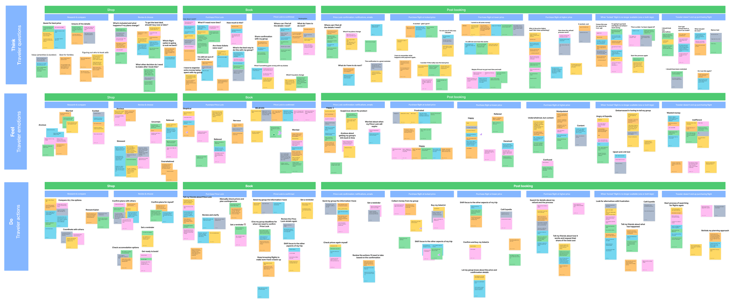
Empathy map
I led an empathy mapping session with our group. The session included a UX designer, a UX design manager, our program manager, and our product manager. I broke it into sections for the shopping and post-purchase phase. As we went through the exercise, we took into account the research, our competitors, our own experiences as travelers, and the known limitations of the product.
Top themes
After creating stickies for each point in the journey, we grouped them into themes. There were a number of mixed emotions.
•Relieved: travelers were able to buy time. They didn’t have to stress if their traveling partners weren’t 100% sure if they could go on the trip.
•Happy: the price went down after they locked, so they were able to purchase at a lower price. Everything went smoothly in the booking process.
•Deceived: the price went down after they locked. They could have just waited, not purchased Price Lock, and would still get the lower price.
•Doubtful: the price stayed the same, so was it worth it to buy Price Lock?
•Confused: the price went up after they locked. If they locked the price, why do they have to pay the higher price and wait for a refund?
•Angry: when the traveler goes to book the flight, it is now unavailable. They were told they had 5 days to book, but now it is sold out and they have to start from scratch.
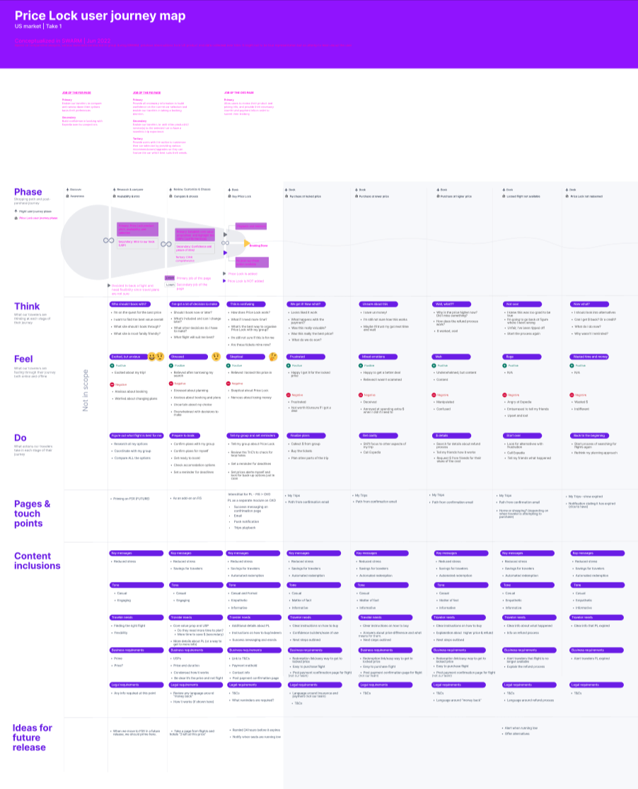
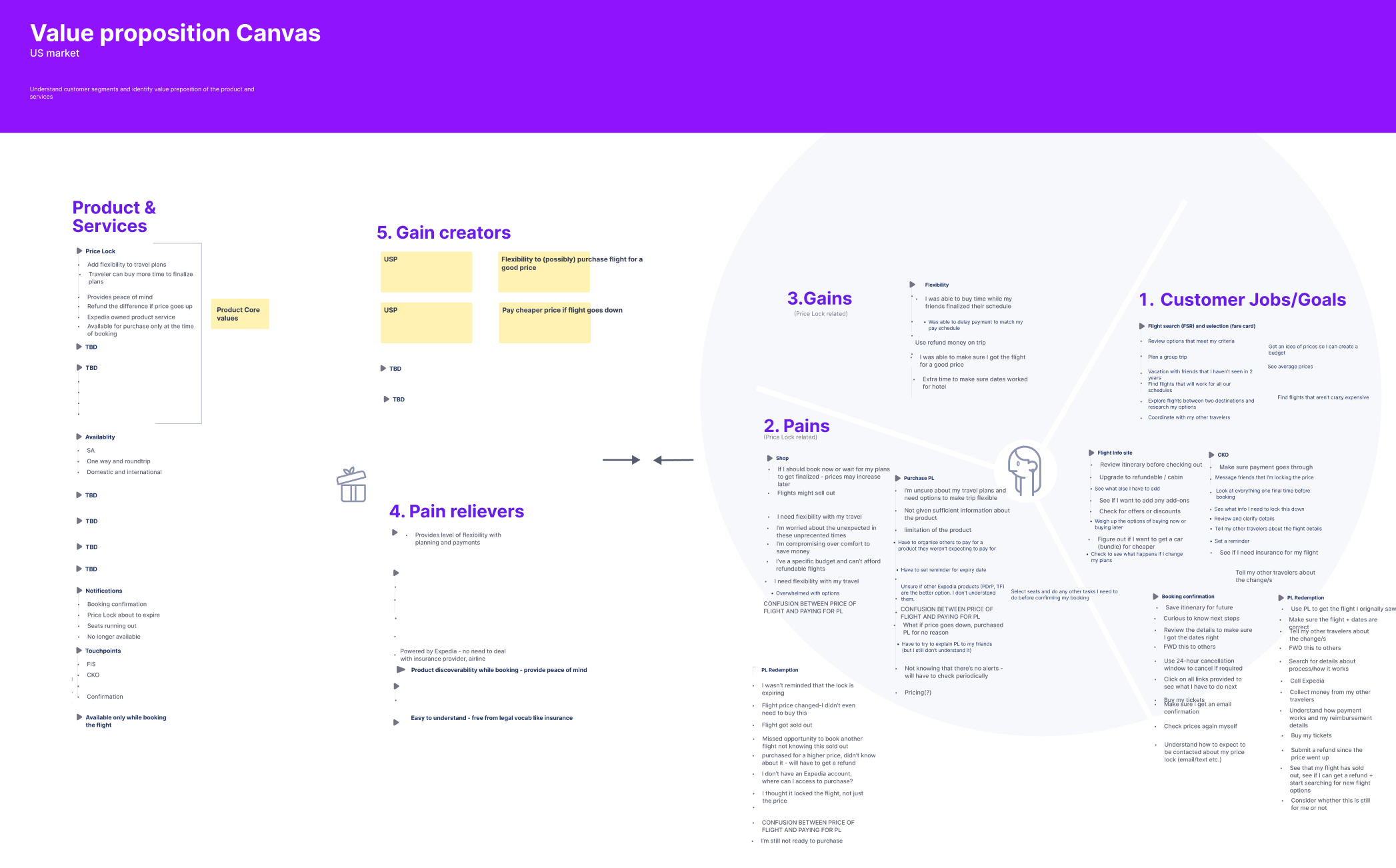
Journey map and value prop canvas
Taking the top actions and themes from the empathy map, I worked with my UX design partner to fill out a journey map for the various touchpoints needed. I then looked at the content needs for phase 1, as well long-term opportunities for a future release. We also filled out a value prop canvas. We struggled to come up with “pain relievers” for our travelers. This is something we had planned on revisiting after additional research.
After completing these exercises, we put together some guiding principles.
•Comprehension and clarity: since this is such a complex product, we need to make it very clear to travelers what they are getting. We want to make it clear that they are buying Price Lock, not booking the flight. We also want to make it clear that this is a fee, not a deposit like some of our competitors have.
•Transparency: there are a number of limitations with the product. We need to make travelers aware so that they know what they are buying.
•Trustworthy: we want to keep their trust. We don’t want travelers to think we are deceiving them by not being transparent.
Our approach
Ideally, this product would give travelers peace of mind and help them lock in savings. But for phase 1, we focused on a more realistic benefit: buying extra time to plan.
We aimed to reach travelers early in their shopping journey, but due to technical constraints, the product could only appear on the booking screen, just before checkout, alongside add-ons like seats and bags. At that point, most travelers were ready to book, which made the timing less effective and added friction when trying to launch.
Early explorations
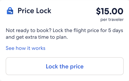
Option 1
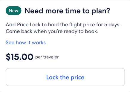
Option 2
I explored a few options and tested two versions. Travelers preferred the one with the product name in the header. Since it’s a new feature, we felt it was important to highlight that upfront.
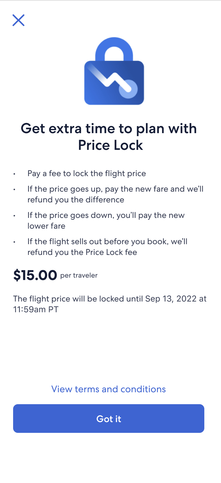
When someone clicks “See how it works,” a modal pops up with just the essentials. The goal was to explain the details clearly without overwhelming them. I focused on the questions we heard most often:
•Is this a fee or a deposit?
•When does it expire?
•Could the flight sell out before I book?
•What happens if the price goes up or down?
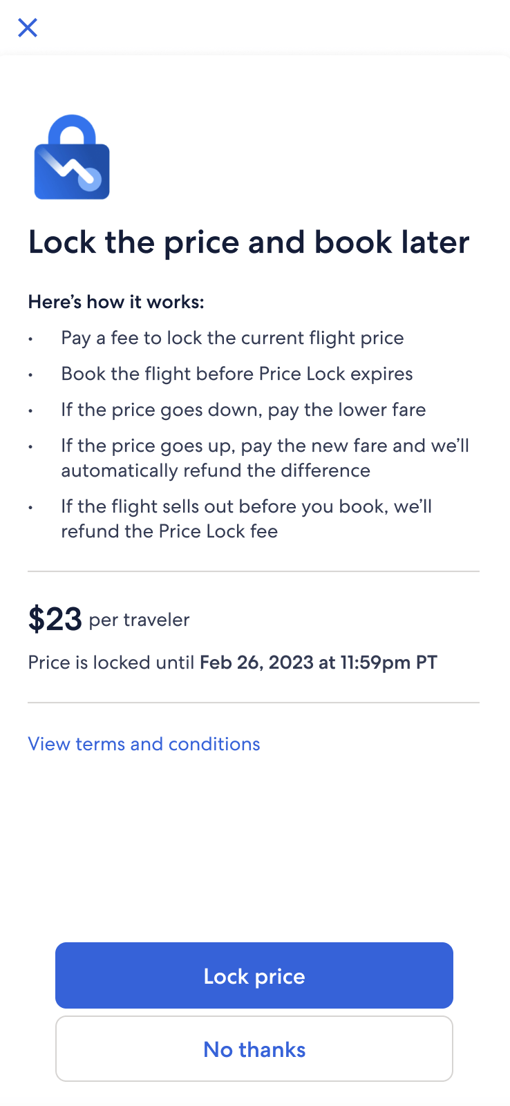
Modal explorations
Option 1
Option 2
Option 3
We ran user research and made changes along the way based on what we learned.
Option 1: Focused on clarity and prioritization. I adjusted the placement of key info like the expiration date and emphasized that flights may sell out. I also clarified how refunds work if the price goes up or down, responding to insights from user testing.
Option 2: Balanced legal requirements with usability. I looked at ways to make the non-refundable fee sound less harsh and worked with legal to avoid overwhelming travelers by saving the refund cap details for later screens. During testing, travelers were most excited about paying the lower price if fares dropped, so I moved that bullet higher for visibility.
Option 3: Simplified the experience by reducing friction. User testing showed that the flow felt too disjointed, so we added a direct link to checkout to keep travelers moving forward. Based on team feedback, I added a functional header to anchor the content. I also revised the layout for better scannability and clarified that users must book before the Price Lock expires.
An alternate way of booking
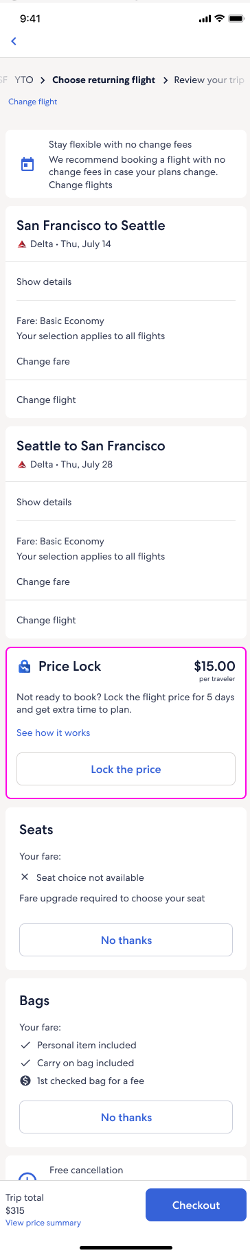
Our UX pod was concerned that Price Lock was being treated like a typical add-on (like a seat or insurance), when it was actually a standalone product. We explored surfacing it earlier in the flow with the flights team again, but that wasn’t feasible. Ultimately, we positioned it as an alternate way to book and not just another add-on.
When travelers chose “Book today,” they see standard flight add-ons. Choosing “Lock the price” removed those options and instead showed Price Lock info. We pushed to surface “Booking options” higher on the screen, but it wasn’t possible.
Legal initially asked us to add refund cap details, but testing showed that too much info overwhelmed travelers—they said they’d skip the offer altogether. So, we simplified bullets here and moved extra info to the checkout and confirmation email.
To align with the live experience, where prices are shown as a total (not per traveler), we displayed the total price under “Booking options” and again at the bottom. Testing revealed confusion, so I also added the per traveler breakdown for both the flight and Price Lock.
Early drafts used phrases like “Price Lock expires,” but I changed it to “Book before” to create urgency and make the next step clearer.
Where we ended up
Due to several limitations that couldn’t be resolved before our phase 1 launch, the project was ultimately paused. I spent about 9 months working on Price Lock, navigating constant challenges and edge cases—especially in the post-booking experience. While much of product design focuses on the happy path, this project required us to prepare for worst-case scenarios. Before wrapping, we documented end-to-end recommendations in case the work resumes in the future.
Price Lock shopping, confirmation, and onboarding email
Slimmed-down bullets performed well in testing, so we kept them on the booking screen. Travelers also appreciated seeing more detailed info on the checkout page, as it provided a sense of reassurance before purchasing. Since this is the final review step, we included expanded details in a collapsible section, following the existing flight display pattern. After purchasing, travelers see a confirmation screen with key details and receive a follow-up email with an overview and a link to their locked flight.
Price Lock active states
Since Price Lock is its own booking, it appears in the Trips section of the app alongside other bookings. From here, travelers can view their locked flight, check for price changes, and complete their purchase. In an ideal state, we’d aim to send notifications about price increases or flights selling out to help travelers stay informed and act quickly.
Price Lock redeemed states
After the traveler books their flight with Price Lock, they will see a screen with the price details.
Price Lock is no longer active
If Price Lock is no longer active, a traveler will see one of these screens depending on the use case.