My approach
I created some general guidelines for the different types of help content.
Page description/instruction
Use general guidance that applies to the entire page and helps users understand how to complete it.
Form labels
Keep labels short and clear—use simple statements when the field is self-explanatory to make it easier to scan.
Question-style form labels
Occasionally, when something is too complex to describe in a few words, it’s okay to ask in the form of a question.
Helper text vs. tooltips
Helper (inline) text provides brief guidance about the field, such as how it will be used. Keep it concise (ideally one or two lines) and focused on a single point. In tax setup, this often warns users or points them to additional resources.
Tooltips offer more detailed support: what the field means, where to find the info, and what to do if they’re unsure. They help users make informed choices now, or they can revisit later.
Most common choice
When one option in a dropdown is used by most users, make that clear to help guide selection.
We then held customer interviews and continued to refine as needed.
Content updates
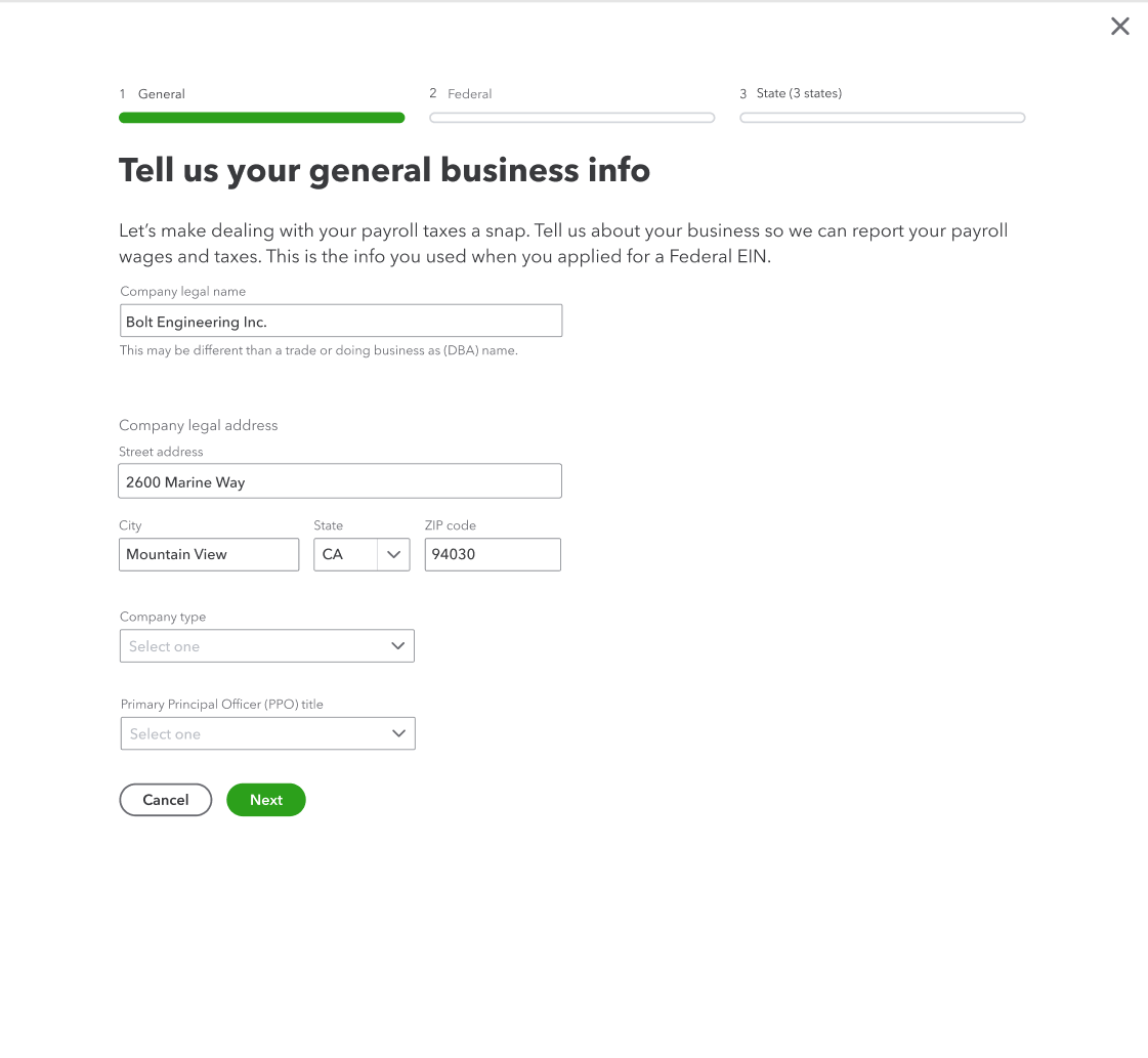
Business info
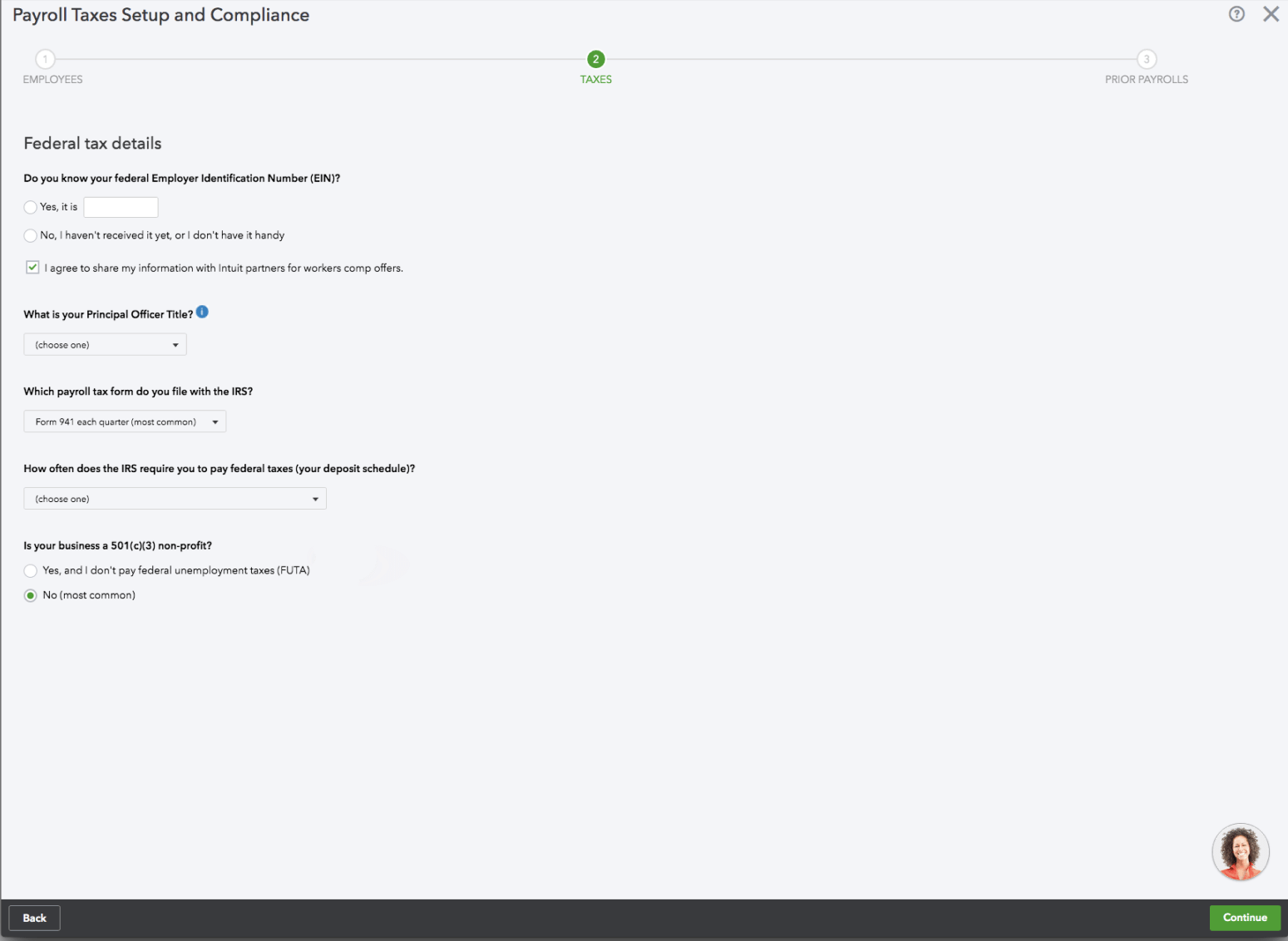
Before
After
I made the content more conversational and changed labels from questions to statements to make it scannable. I reminded customers where they can find some of the required info, and I removed anything that could be saved for later in the flow.
Federal tax info
Before
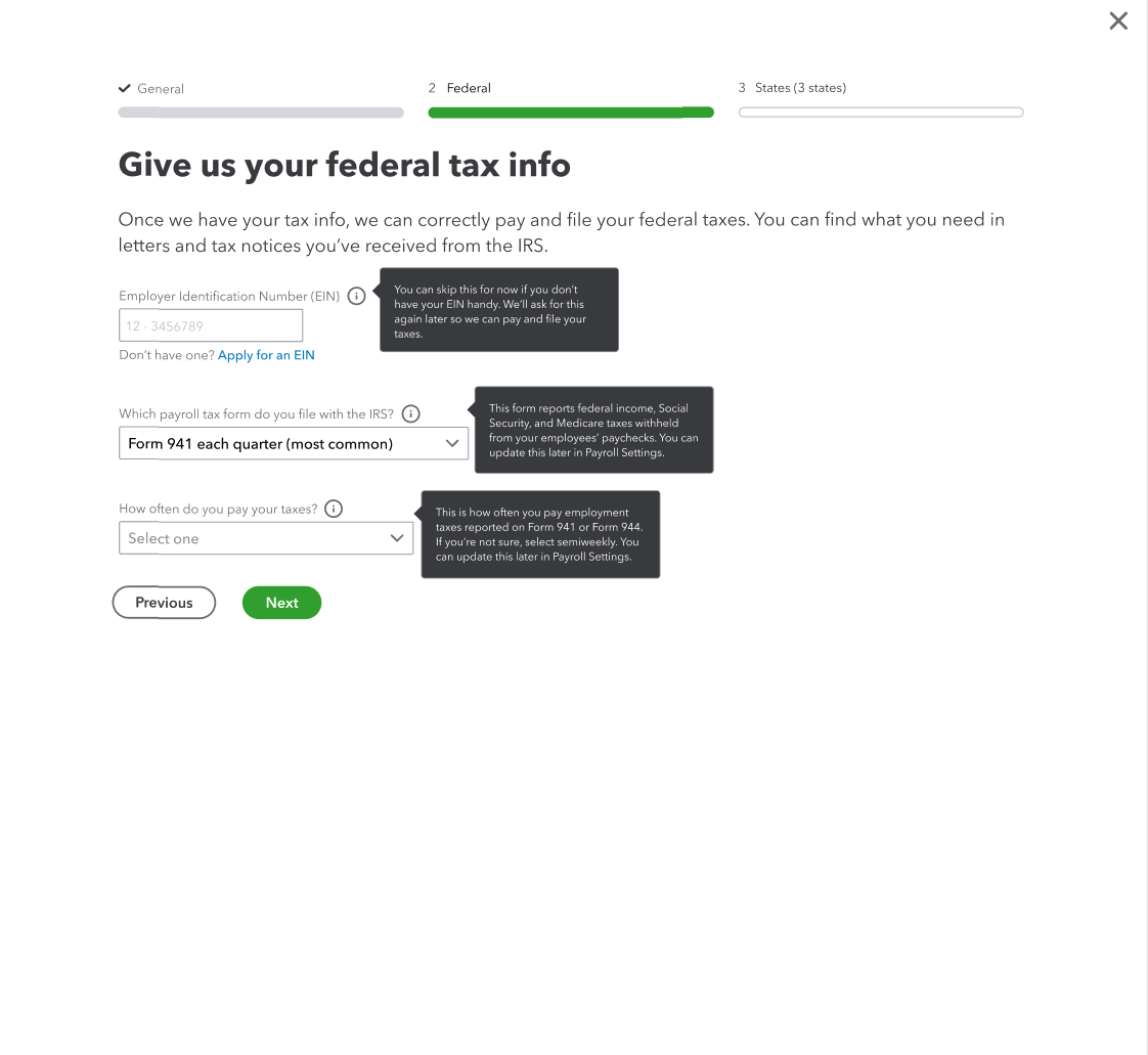
After
It was important to tell people why we needed this info and where they could find it. In user testing, customers didn’t know the names of the forms and were confused when the specific names were used. I updated to “letters and tax notices” and they found that more helpful. I added tooltips and tightened up the field labels. I also added a link so customers could apply for an EIN if they didn’t have one.
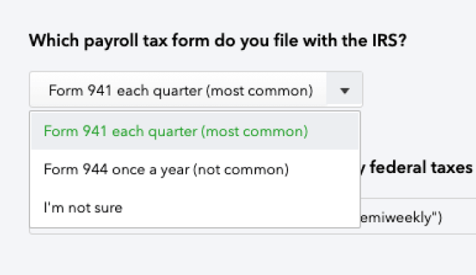
Payroll tax form dropdown
Before
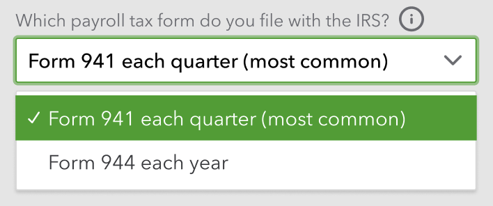
After
I simplified the choices by defaulting to the most common option. I also use a tooltip to explain that they can change this answer later if needed.
Payment schedule dropdown
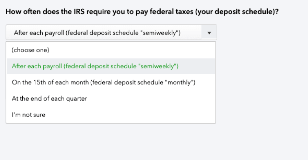
Before
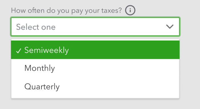
After
I considered changing “semiweekly” to “twice a week,” but decided to match what the IRS uses. I tightened up the options and as I did with the previous dropdown, I used a tooltip to tell people where they can change their answer later.
EIN tooltip
All the info presented.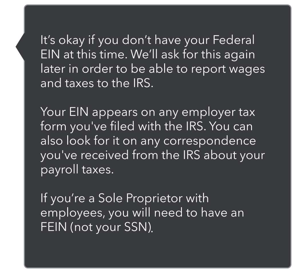
Figuring out the hierarchy.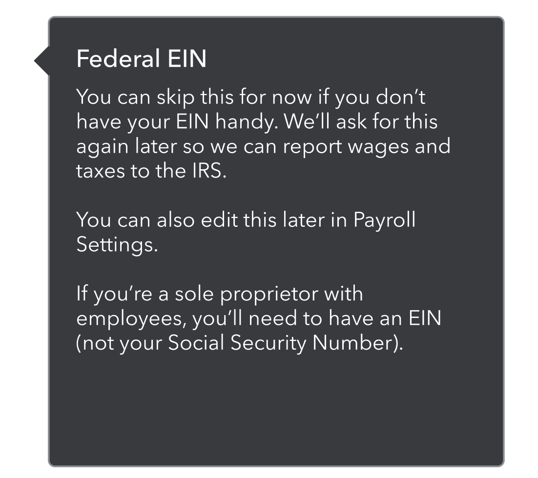
The final version.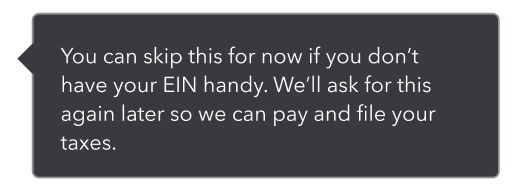
With the tooltips, I needed to provide extra info without having too much text. To start, I took all the info and tried to figure out what was absolutely necessary and what I could cut. I then played around with the hierarchy, and then cut even more.
Payroll tax form tooltip
All the info presented.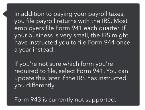
Figuring out the hierarchy.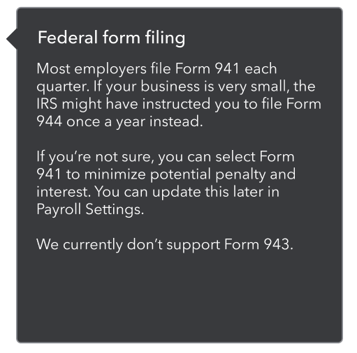
The final version.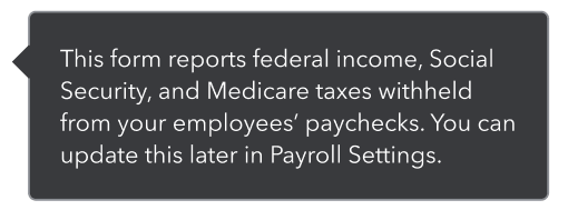
Payment schedule tooltip
All the info presented.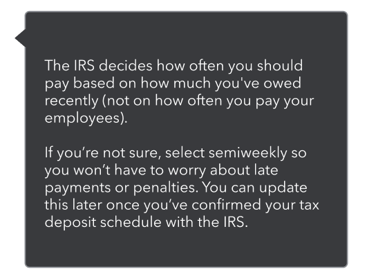
Figuring out the hierarchy.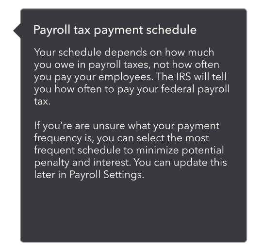
The final version.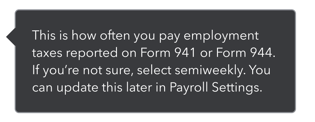
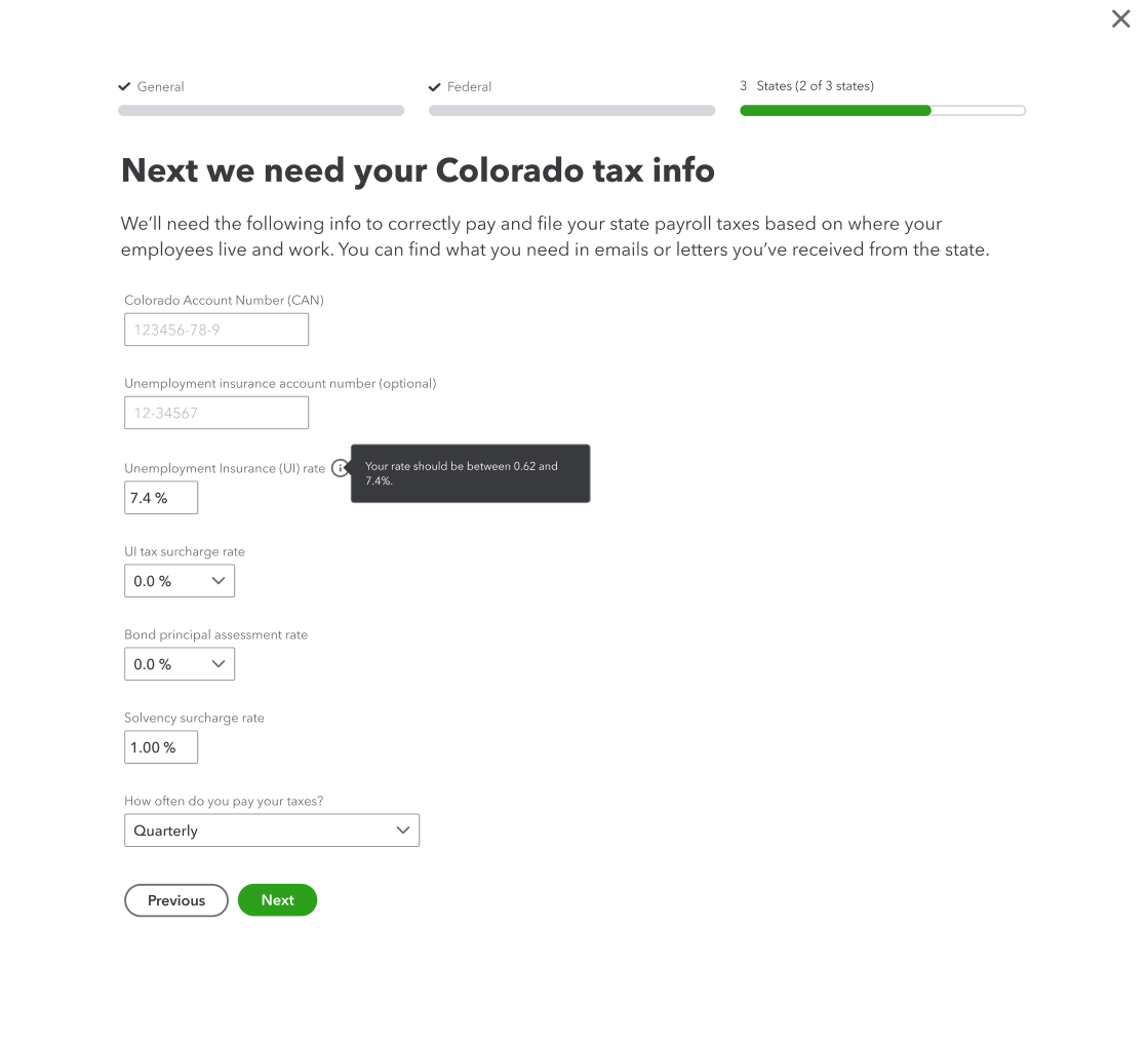
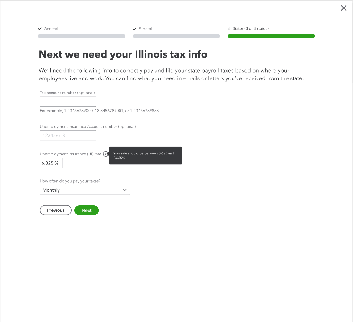
State tax info
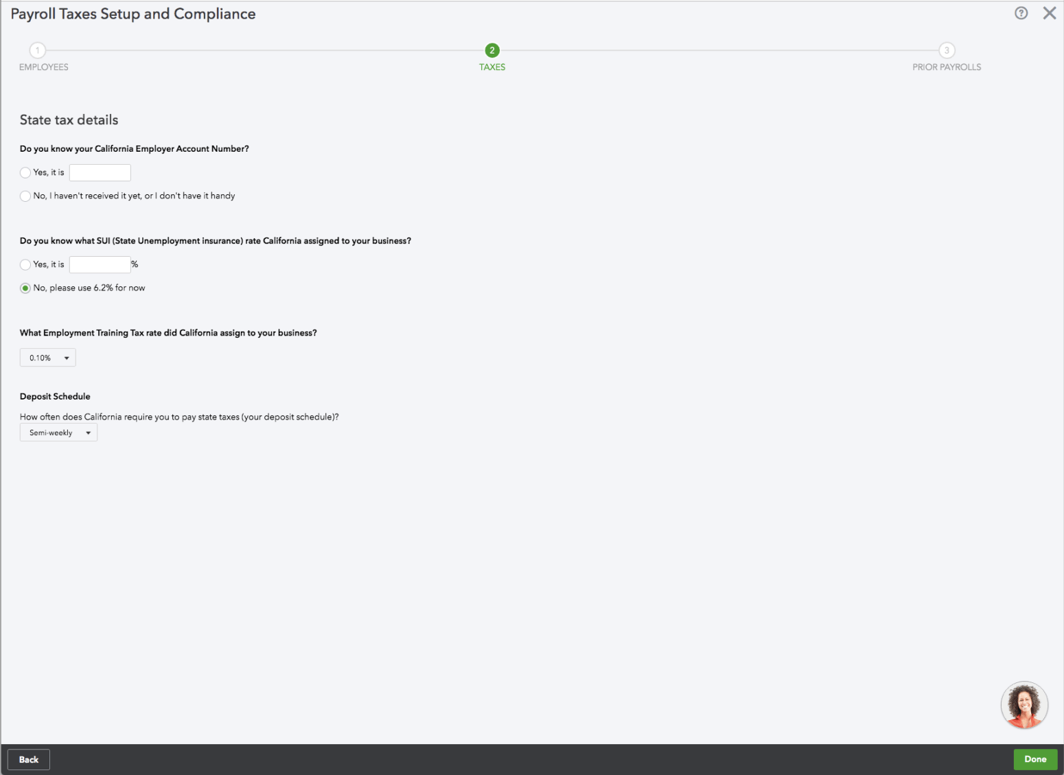
Before
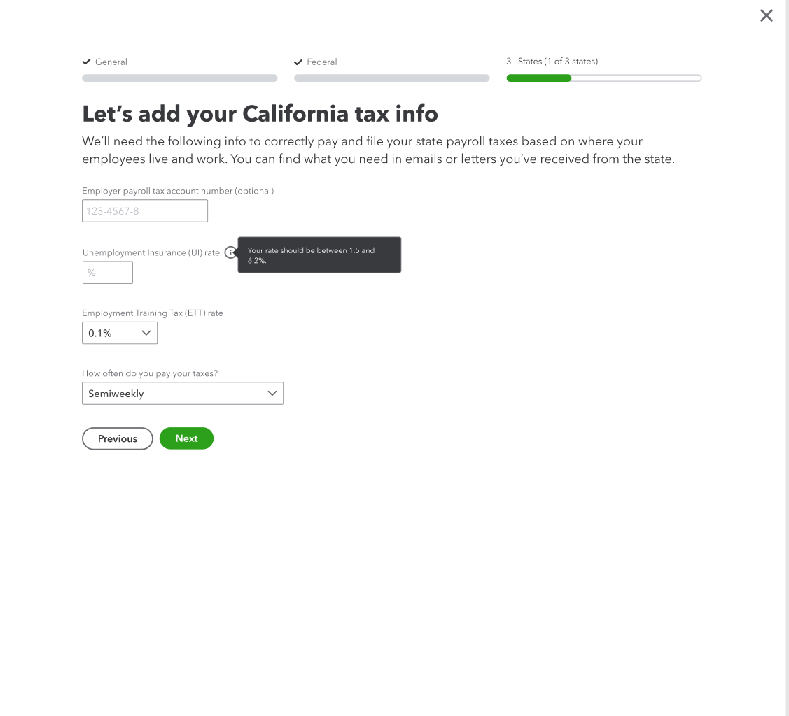
After
As with the previous setup screens, I made the text more conversational and explained why we were asking for this info and where they can find it. I added the state name to the header and removed it from the individual field labels. I tightened up the content and removed anything that wasn’t needed at this step.