Designing content that gives travelers the flexibility they need while driving higher booking rates for Expedia
The problem
Expedia customers were hesitant to book a flight in case they needed to cancel. Refundable fares felt too expensive, and insurance options were often too restrictive. Many waited until they were absolutely certain their whole group could travel. By that time, flights had either increased in price or sold out, and customers turned to other travel sites. Expedia needed a way to offer more flexibility, retain customers, and increase attach rates.
The solution
Give travelers the flexibility to easily cancel their trip without losing the full value of their booking. The content needed to be simple, clear, and engaging, while explaining how the product worked without overwhelming users. Reassuring travelers that they didn’t have to jump through hoops to get their money back would give them the confidence they needed to book.
My role
As the content designer on this project, my strategy centered on creating simple, clear content that built trust in the experience. I worked closely with my design partner, our user researcher, our product manager, engineering, and our legal partner.
I joined the project in summer 2022, picking it up after a pause in 2020. Research had started in 2019, so we reviewed past findings, met with the previous design pod, gathered competitive insights, and kicked off the discovery process.
The process
Empathy map
I participated in an empathy mapping session with another content designer, two UX designers, and our product manager. We broke it into sections for the shopping and post-purchase phase.
Top themes
After creating stickies for each point in the journey, we grouped them into themes. There were a number of mixed emotions.
•Confident: ready to book the flight and happy to have flexibility if they need to cancel later.
•Peace of mind: No need to worry about dealing with flight credits or losing money if they have to cancel.
•Unsure: Would it have been better to buy insurance? Did they make the right choice?
•Doubtful: if they don’t end up cancelling, did they waste money? Is it really easy to get a refund?
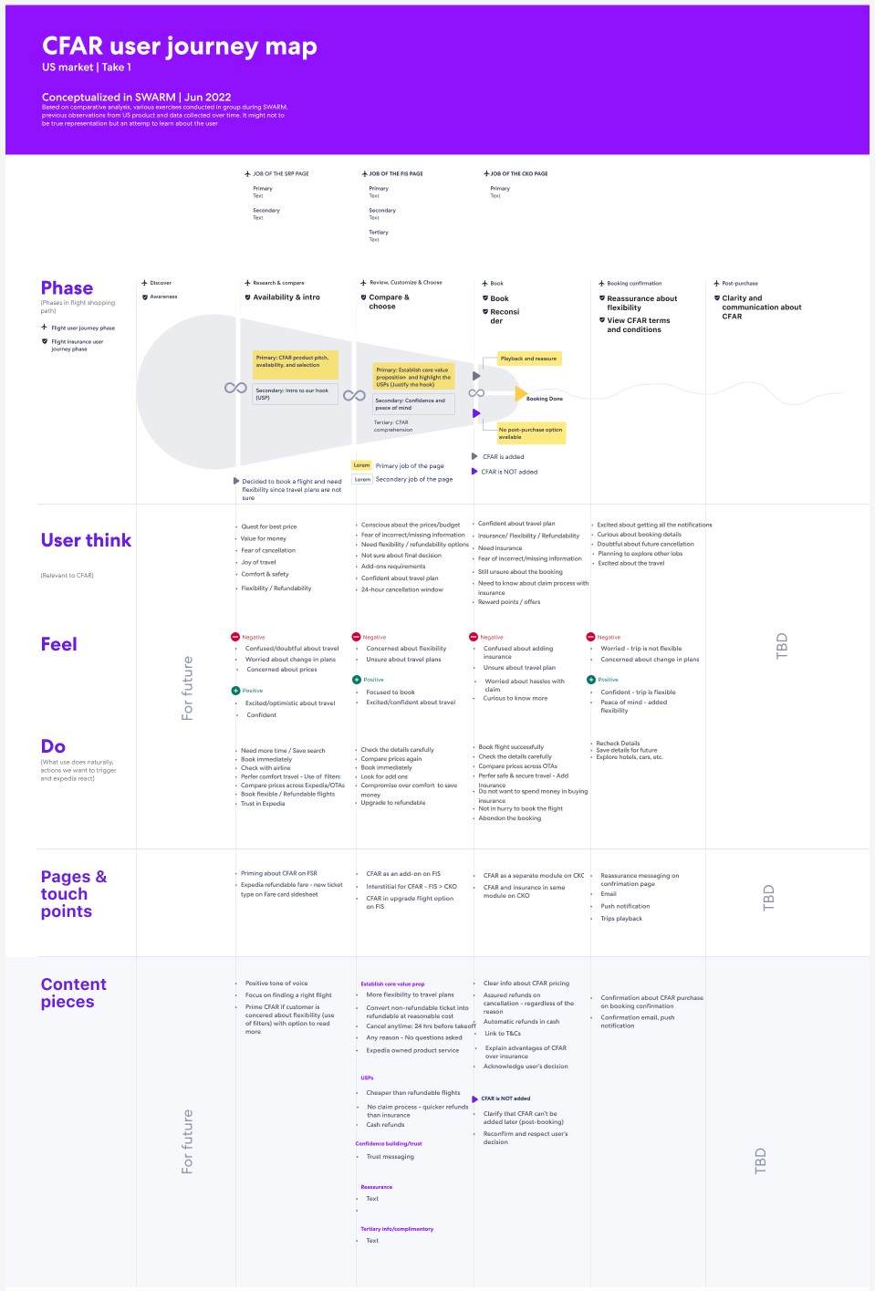
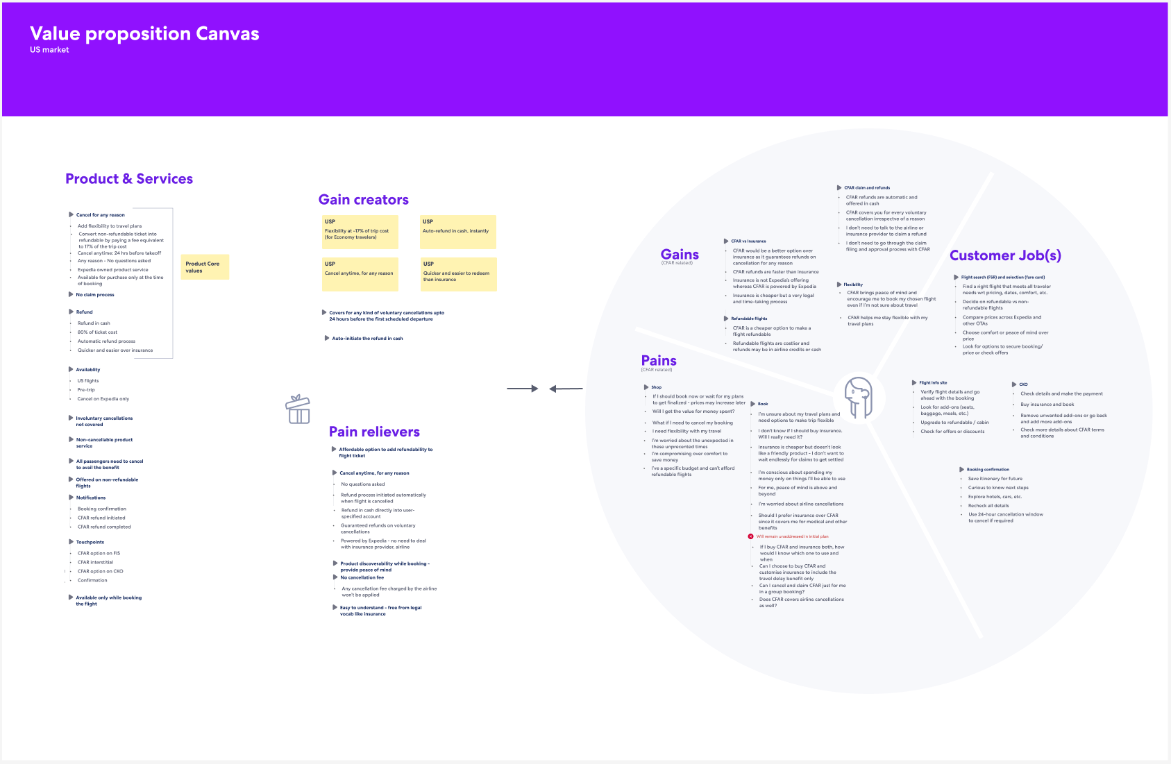
Journey map and value prop canvas
I worked on a journey map with my design partner, looking at the end-to-end flow and pinpointing the different touchpoints that were needed. I looked at the content needs for each touchpoint. We then filled out a value prop canvas to think about the unique selling points and how we can help our travelers.
A new approach
After working on content and designs that we wanted to test, this project was paused. I picked it up again in the fall of 2023. Because we had limited time for discovery, I reviewed my previous work as well as the previous research. I looked to see what had changed in the competitive landscape. Then I had a few brainstorming sessions with my XD pod as well as in content crits.
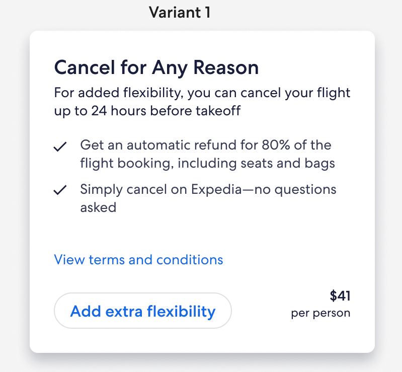
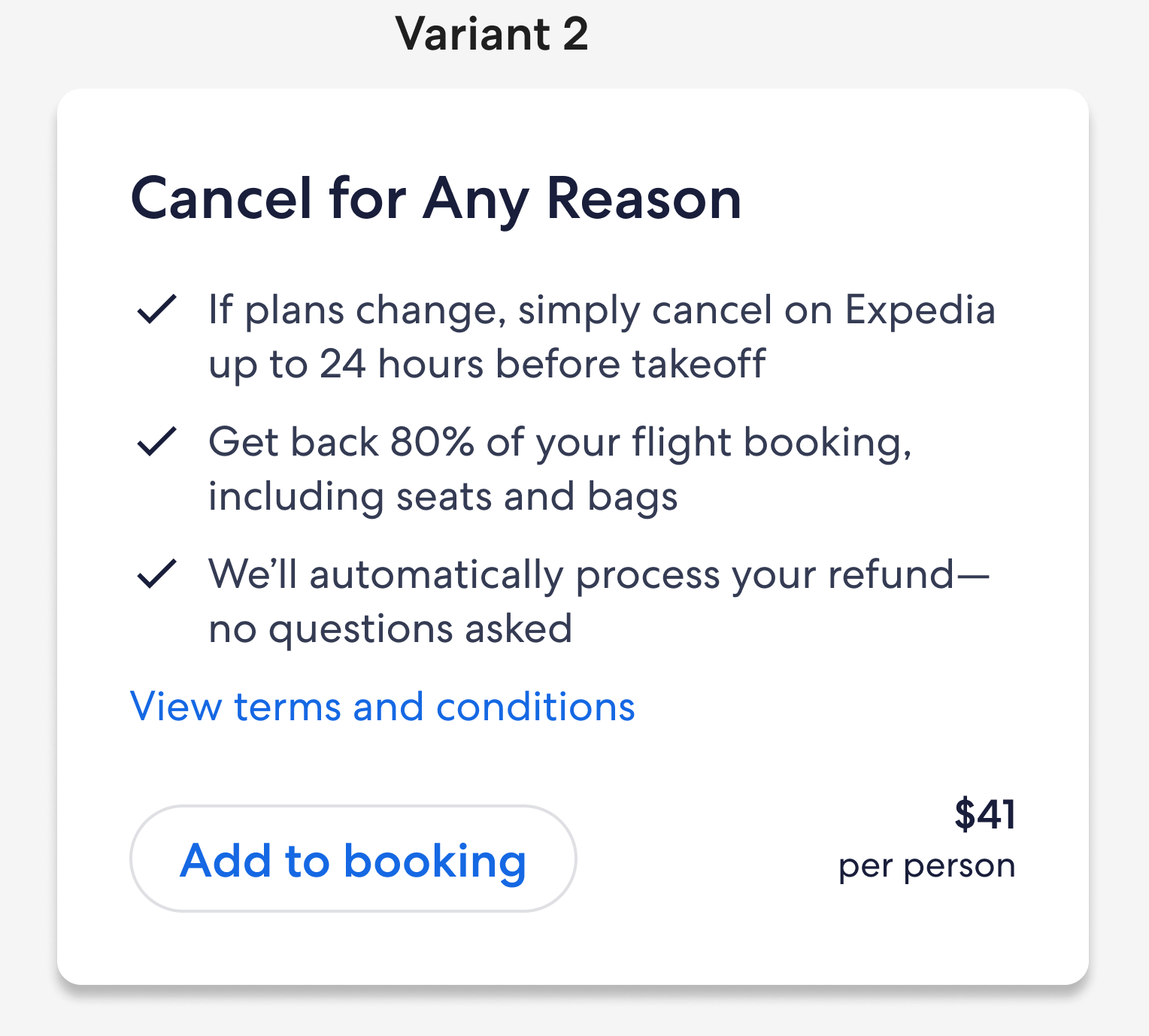
In previous user research, people said they were interested because Cancel for Any Reason seemed so much easier and more flexible than insurance. They called out the fact that they wouldn’t have to file a claim or jump through any hopes to get a refund. I explored a few options calling out the fact that no claims were needed. However, I didn’t want to undercut our own insurance product, so I instead tried to focus on how easy the process will be.
After narrowing down my options, I worked with our UX researcher on a test plan. The main thing I wanted to test was comprehension. Because we were limited to a small module, I had to make every word count. I focused on two different themes: flexibility vs peace of mind.
While travelers understood the concept and it aligned with their expectations, they preferred the second option. The word “flexibility” felt unclear because that word is used elsewhere to describe airline policies.
A big concern for travelers was the link to the terms and conditions. The content is telling them that they can easily cancel and get a refund, no questions asked. Having the phrase “view terms and conditions” underneath caused some travelers to be skeptical. They thought the terms would outline strict conditions that would contradict the content in the module. Since that language and linking to the terms at that touchpoint is a legal requirement, it posed a problem. I walked our legal partner through our research findings and shared my concerns. I came up with a variety of options to use instead of “view terms.” While I always aim to set expectations, this was a case for us to use different wording. We agreed on “Get more details” as the CTA.
Where we ended up
We launched in May 2024 to 20% of non-refundable, basic economy flights on American Airlines. The pilot was a success and we rolled out to 100% in November of 2024. We are currently looking at expanding this product to other areas of the business. Below are the final screens where travelers can add the product, see a confirmation message, and have the option to remove if they change their mind.