Price Lock | Reducing price anxiety to improve flight conversion
The problem
Planning a trip can be stressful. Travelers often feel pressure to book quickly because prices can change at any time. Many want more time to plan, but waiting can mean paying more later. This hesitation leads to anxiety and, ultimately, lost bookings. Expedia needed a way to give travelers peace of mind while also boosting air conversion.
The solution
Price Lock gives travelers a short window to hold a flight price while they decide. If the fare goes up during that time, they pay the higher price and get the difference back. If it drops, they pay the lower price. Reminders are sent before the lock expires.
Based on competitor patterns, we believed reducing price anxiety while travelers were still finalizing their plans could meaningfully improve conversion. As a result, Price Lock was expected to increase bookings by 9%.
My role
I led the content strategy and partnered closely with product, design, research, engineering, and legal. Earlier research and competitor insights showed that travelers struggled to understand the product, so I focused on transparency and clear expectations to keep the experience simple, reassuring, and easy to understand.
Known limitations
Price Lock had a few known limitations that informed how we designed and explained the experience.
• Travelers could lock in a price, but not a seat, which meant a flight could sell out before they completed their booking.
• Some schedule changes, even minor ones, would cancel the price lock, which might not align with expectations.
• If fares went up, travelers would need to pay the higher price upfront and wait for a refund, which could feel surprising or lead to sticker shock.
These limitations reinforced the importance of being upfront and clear about how Price Lock would work, especially in moments that could surprise travelers.
Discovery & collaboration
The idea for Price Lock (previously called Price Freeze) had been explored in past research. Our team reviewed existing insights, audited competitor flows and content, and mapped the ideal experience from a traveler’s point of view.
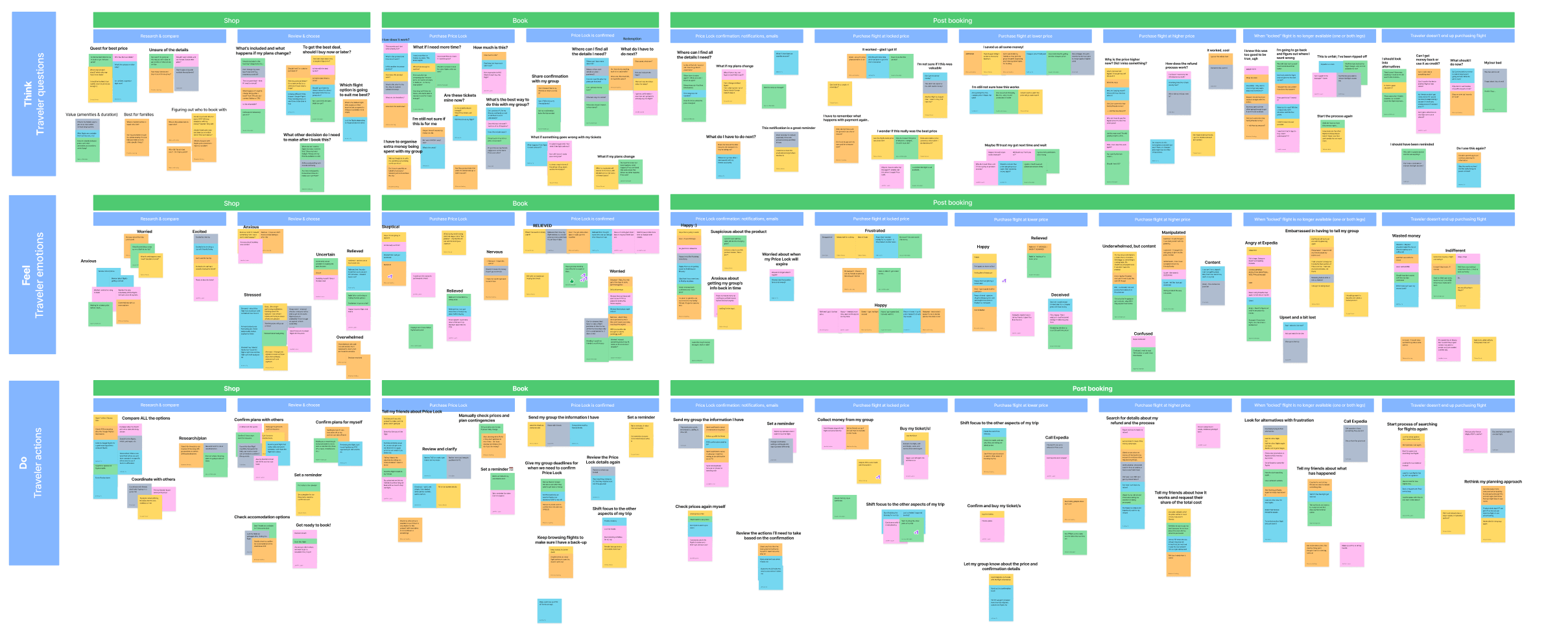
Empathy map
I led an empathy mapping session with our core team. This included a UX designer, design manager, product manager, and program manager. We broke the flow into shopping and post-purchase phases and drew from research, competitive insights, personal experiences, and known product limitations.
Key traveler emotions
After mapping reactions across the journey, we grouped them into core themes. Many of these emotions were mixed or even conflicting:
• Relieved: They had time to finalize plans with others.
• Happy: The price dropped, and they paid the lower fare with no hiccups.
• Deceived: The price dropped, but they realized they would’ve paid less by waiting.
• Doubtful: The fare stayed the same. Was Price Lock worth it?
• Confused: The price went up. Why pay more upfront if they locked the price?
• Angry: The flight was no longer available, despite being told they had five days to book. Now they have to start from scratch.
These reactions helped us understand what travelers valued most: clarity, fairness, and follow-through.
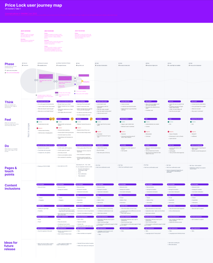
Journey map & value prop canvas
Working with my UX design partner, I mapped key touchpoints across the experience to understand where Price Lock could support travelers. This helped identify content needs for the initial phase and opportunities for future iterations.
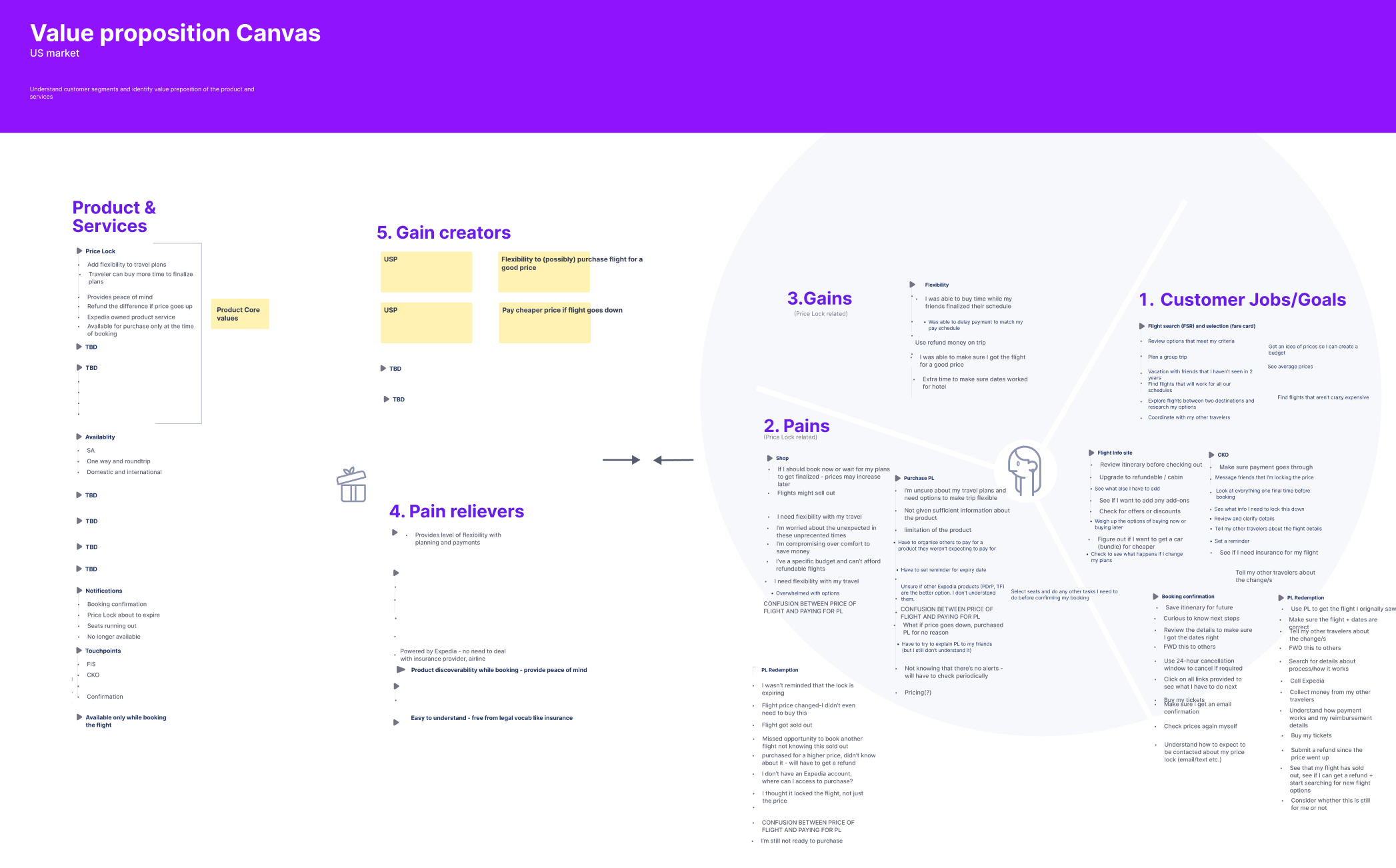
We also used a value prop canvas to explore how Price Lock could deliver value. While potential gains were clear, defining “pain relievers” was more challenging, so we flagged this as a priority for future research.
Guiding principles
From these exercises, we defined three principles to guide the content and design decisions:
• Clarity: Make it clear that travelers are locking a price and not booking a flight. They’re also paying a fee, not a deposit like some competitors offer.
• Transparency: Be upfront about what Price Lock does and does not include.
• Trust: Use straightforward language so travelers don’t feel misled or surprised.
Our approach
We designed Price Lock to give travelers peace of mind by locking in a good fare. For phase one, we focused on a more tangible benefit: giving travelers extra time to plan.
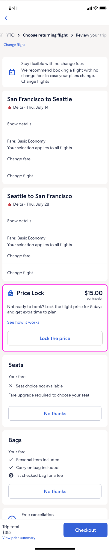
Ideally, we wanted to introduce Price Lock earlier in the shopping journey. Due to technical constraints, it only appeared on the booking screen, just before checkout, alongside add-ons like seats and bags. By that point, most travelers were ready to book.
Early explorations
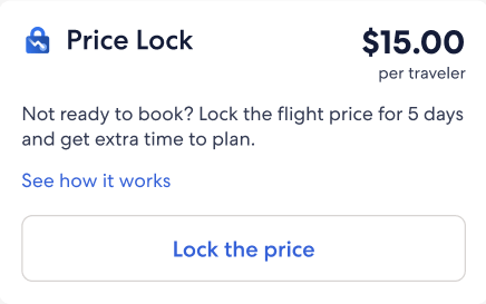
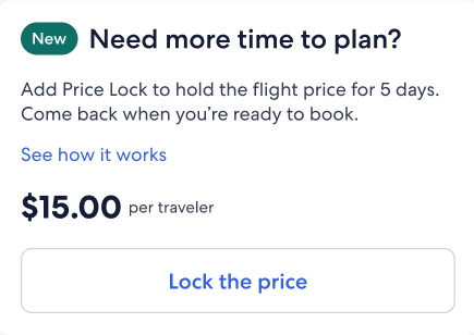
I explored a few different content approaches and tested two versions. Travelers preferred the version with the product name in the header, which helped them quickly recognize Price Lock as a new feature.
Option 1
Option 2
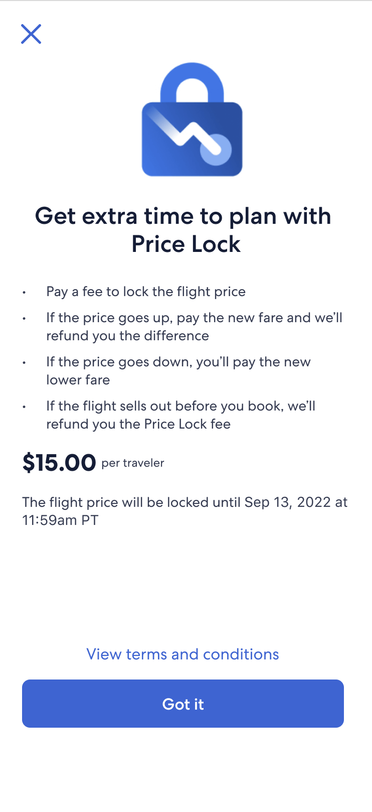
When travelers clicked “See how it works,” a modal opened with the key details. I kept the content focused and direct, answering the most common questions we heard in research:
• Is this a fee or a deposit?
• When does it expire?
• Could the flight sell out before I book?
• What happens if the price goes up or down?
Modal explorations
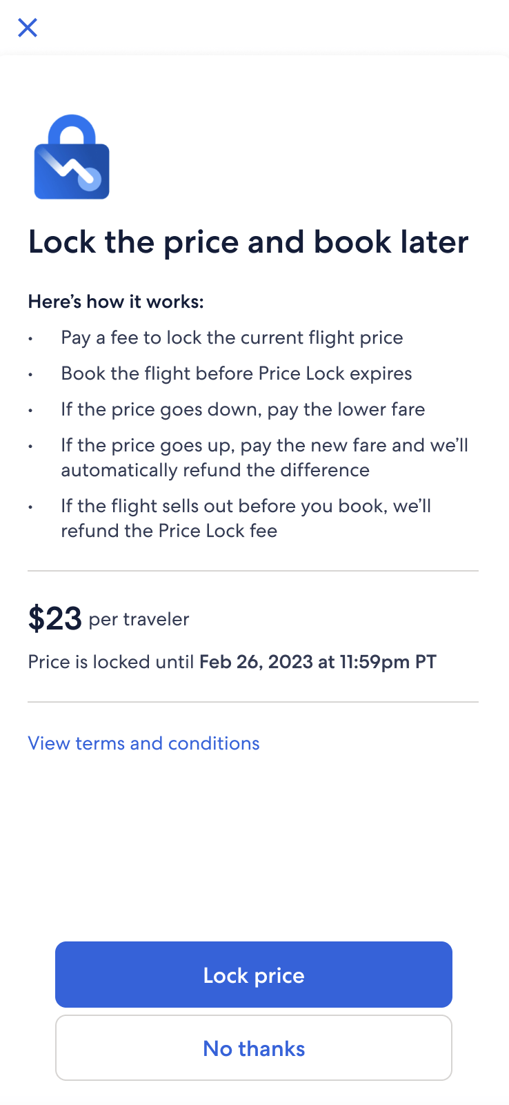
This modal had a lot to do in a small space. It needed to set expectations, introduce a new product, and build trust. We took a few versions into research, made changes based on feedback and questions, and partnered with legal and design to find the right balance.
Option 1
Option 2
Option 3
Option 1: Focus on clarity and key details
• Prioritized the expiration date and highlighted that flights could sell out.
• Clarified what happens if prices go up or down, based on common user questions.
• Focused on reducing confusion and setting expectations early.
Option 2: Balance legal requirements with usability
• Softened language around the non-refundable fee to reduce perceived friction.
• Collaborated with legal to move refund cap details to later screens, avoiding information overload.
• Moved the price-drop benefit higher in the list after testing showed it was most exciting to users.
Option 3: Reduce friction and streamline the flow
• Added a direct path to checkout after testing showed the flow felt disjointed.
• Introduced a functional header so travelers could quickly understand what they were doing.
• Simplified layout for scannability and reinforced that booking must happen before Price Lock expires.
• Focused on maintaining momentum and clarifying next steps.
While these versions didn’t ship, the testing and iterations sharpened our understanding of traveler needs and informed future decisions.
A new way to book
Price Lock wasn’t just another add-on like seats or insurance. It introduced a different way to book. We pushed again to surface it earlier in the flow, but technical constraints kept it on the booking screen, so we focused on positioning and clarity.
Travelers who selected “Book today” saw standard add-ons, while those who chose “Lock the price” saw Price Lock details instead. We pushed to move “Booking options” higher for visibility, but layout constraints kept it lower on the page.
Legal initially recommended including refund cap details here, but testing showed it overwhelmed users. We simplified the bullets and moved supporting details to checkout and the confirmation email.
To reduce confusion, I added a per-traveler price breakdown and changed “Price Lock expires” to “Book before” to make the next step clearer and more actionable.
Where we ended up
Although the project was paused before launch, I spent about nine months shaping the Price Lock experience, from early flow concepts to post-booking edge cases. Much of the work focused on planning for less-than-ideal scenarios, not just the happy path. We documented the end-to-end experience and captured content recommendations to support a future release if the work resumes.
Price Lock shopping flow
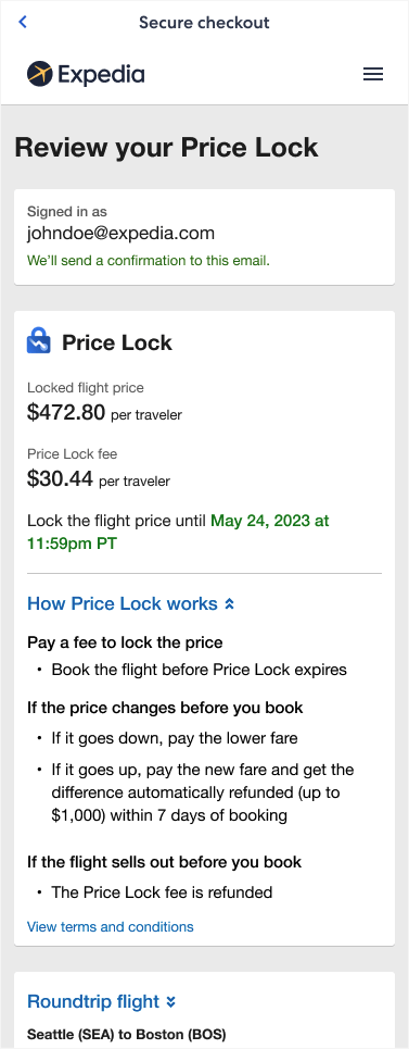
Slimmed-down bullets performed well in testing, so we kept them on the booking screen. Travelers appreciated seeing more detail on the checkout page, where it provided reassurance before purchasing.
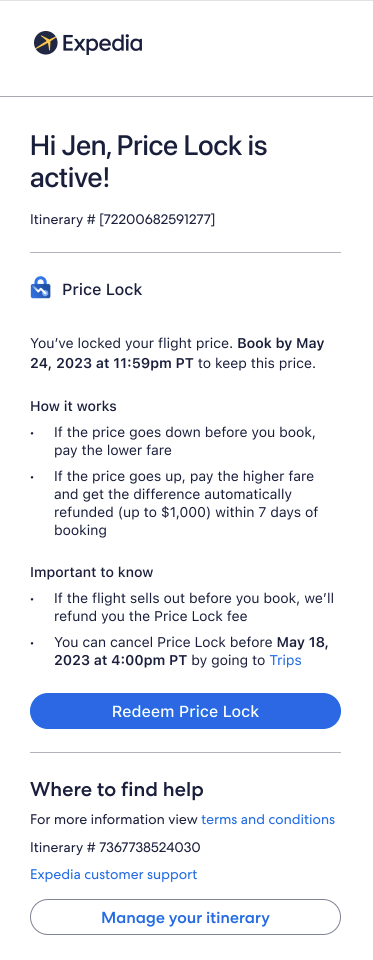
Because this is the final review step, we placed expanded details in a collapsible section that followed the existing flight display pattern. After purchase, travelers see a confirmation screen with the key details.
Price Lock post-purchase
Travelers receive an onboarding email with an overview and a link to their locked flight. Since Price Lock functions as its own booking, it appears in the Trips section alongside other reservations. From there, travelers can view their locked flight, check for price or status changes, and complete their purchase.
Working on Price Lock taught me how to design content for complex, uncertain scenarios where things might go wrong and the path isn’t always straightforward. It strengthened my ability to advocate for clarity within technical and legal constraints, and to guide travelers with content that is honest, helpful, and easy to act on.