My approach
I developed a set of guidelines to ensure help content was clear, consistent, and supportive throughout tax setup. These principles shaped how I approached content decisions across the flow:
•Page descriptions: Provide general guidance that applies to the full page and explains how to complete it.
•Form labels: Keep labels short and clear. Use simple, scannable statements for self-explanatory fields.
•Question-style labels: For more complex fields, frame labels as questions to make them easier to understand.
•Helper text vs. tooltips:
•Helper text: Brief inline guidance on how a field is used, typically one or two lines to keep users focused.
•Tooltips: More detailed support for complex fields, including what the field means, where to find information, and what to do next if unsure.
•Most common choice: Highlight the most common dropdown option to gently guide users toward the right selection.
After defining these patterns, we validated them in customer interviews and refined the approach based on feedback.
Content updates
Here are a few examples of how I simplified complex tax guidance across the flow.
Business info
Before
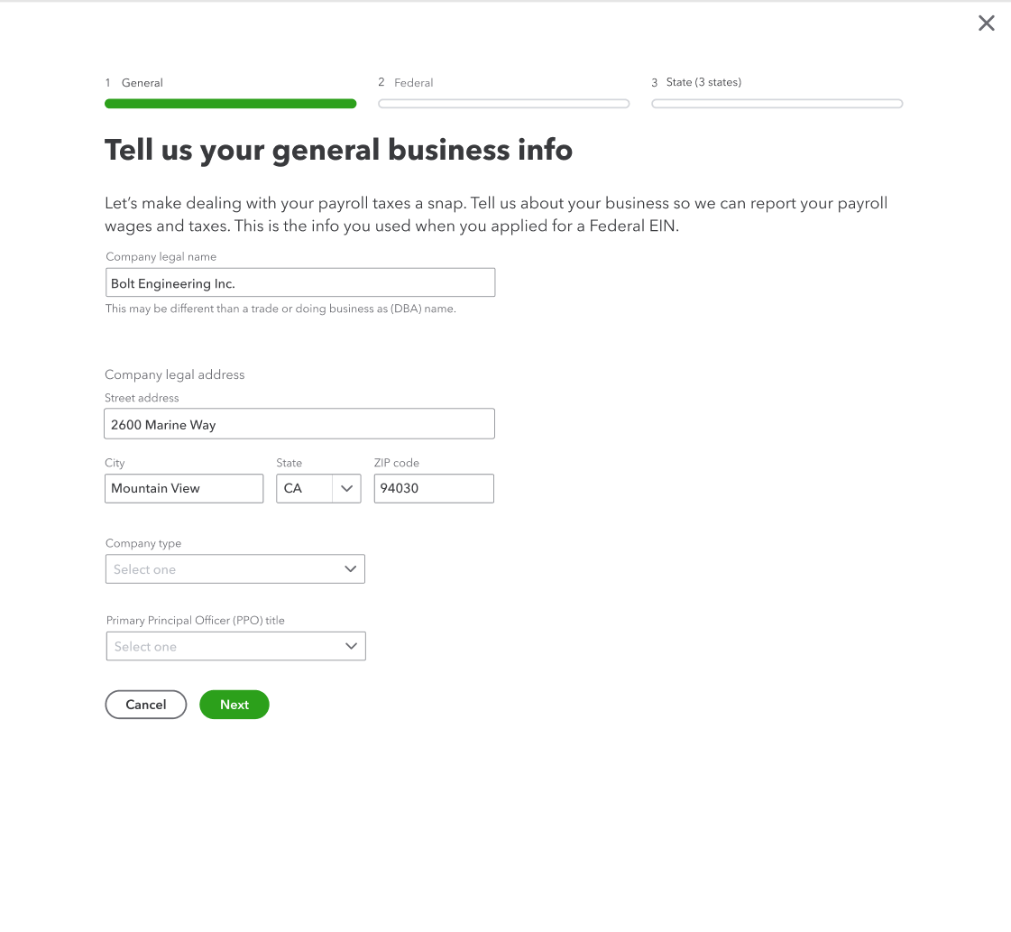
After
I made the content more conversational and changed question-style labels to clear statements to improve scannability. I also reminded customers where to find required information and removed details that could be addressed later in the flow to keep the page focused.
Federal tax info
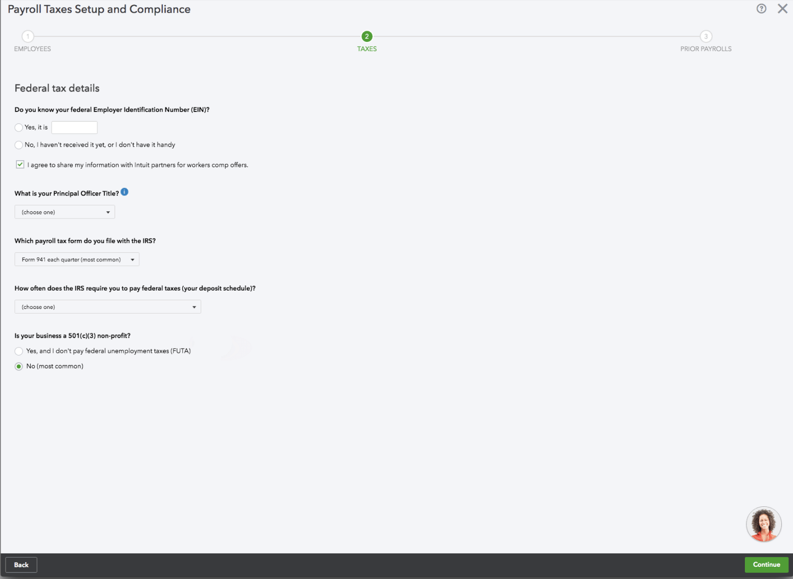
Before
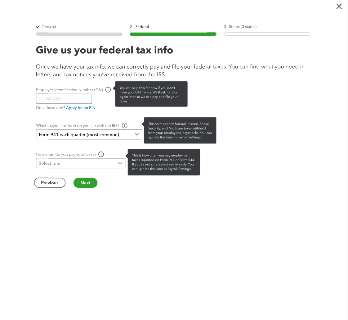
After
This step needed clearer context so customers understood why we were asking for this information and where to find it. I updated the guidance to explain the purpose of the fields and point customers to the right documents.
In testing, we also found that many customers didn’t recognize official form names, so I replaced them with simpler language like “letters and tax notices,” which users found clearer. I added tooltips, tightened field labels, and included a link to apply for an EIN if needed.
Payroll tax form dropdown
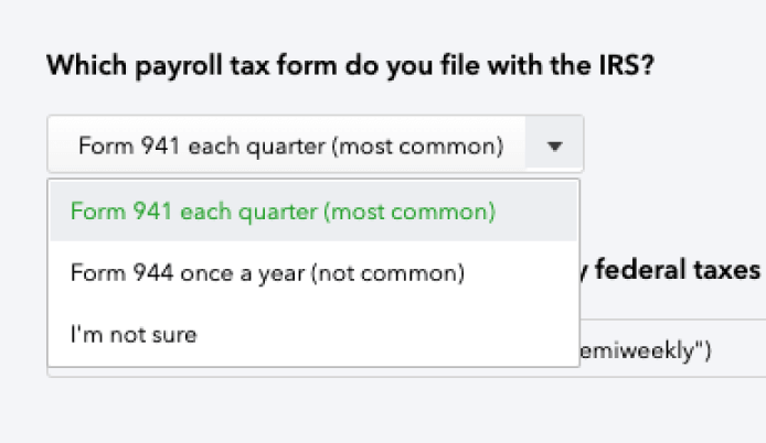
Before
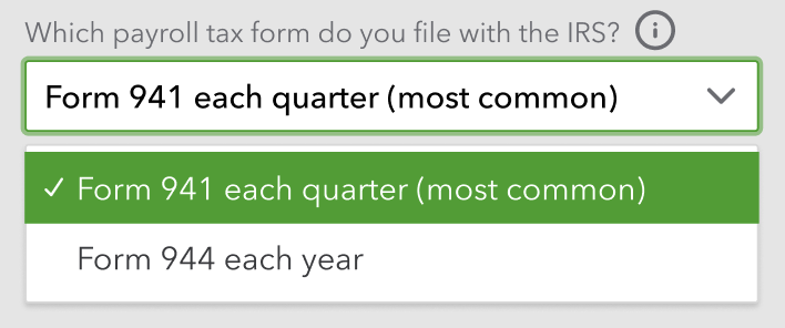
After
I simplified the experience by defaulting to the most common selection. I added a tooltip to reassure customers they could change their answer later, which reduced pressure if they felt unsure.
Payment schedule dropdown
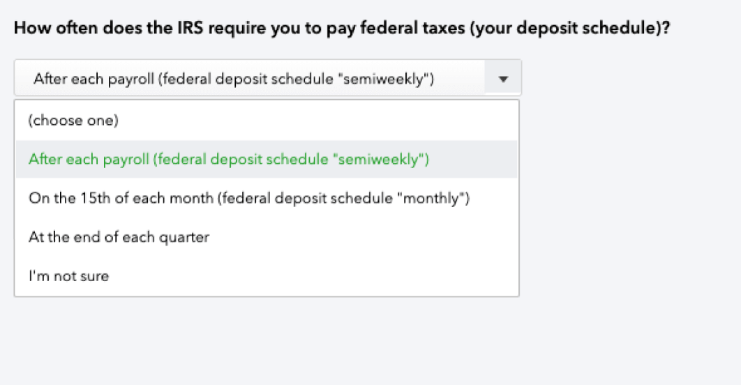
Before
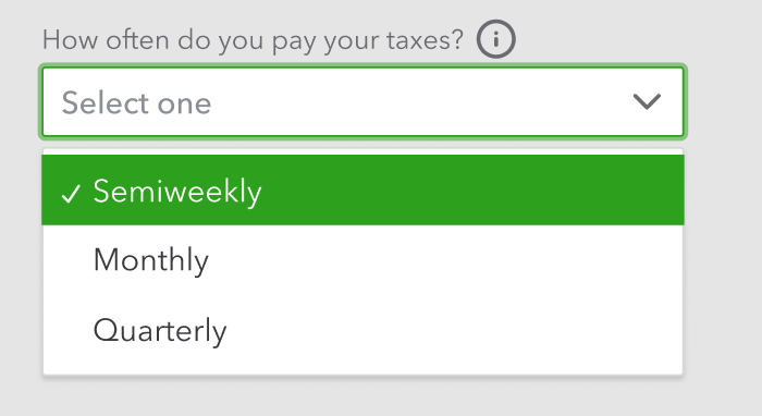
After
I considered replacing “semiweekly” with “twice a week,” but kept the IRS terminology to avoid confusion with official documents. I tightened the options and added a tooltip to remind customers they could update their choice later if needed.
EIN tooltip
All the info presented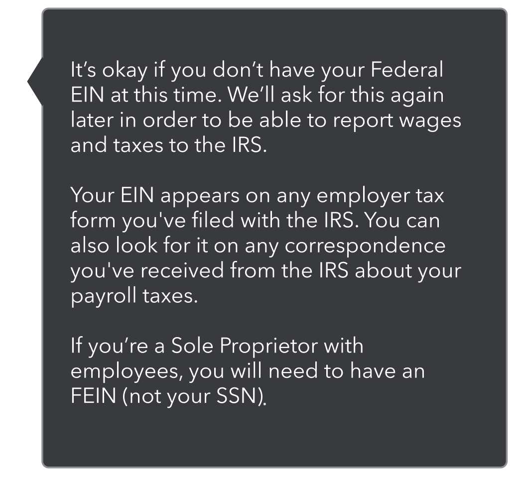
Figuring out the hierarchy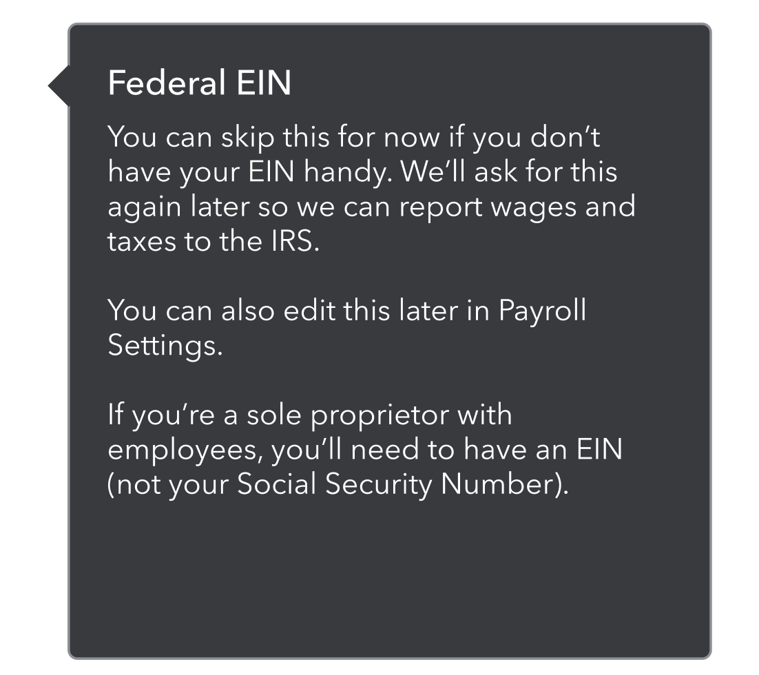
The final version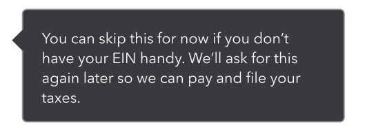
For the tooltips, I focused on giving helpful context without overwhelming customers. I started by identifying what information was essential, then refined the hierarchy and trimmed anything extra to keep it concise.
Payroll tax form tooltip
All the info presented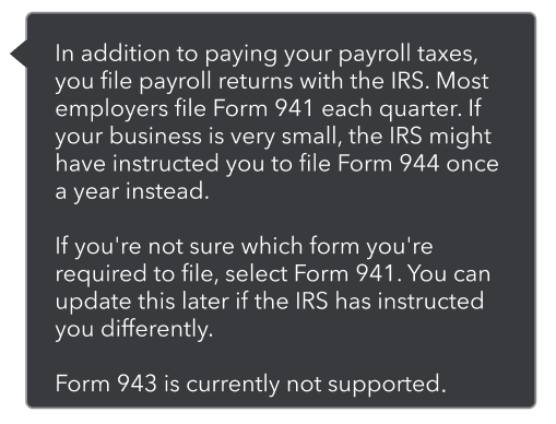
Figuring out the hierarchy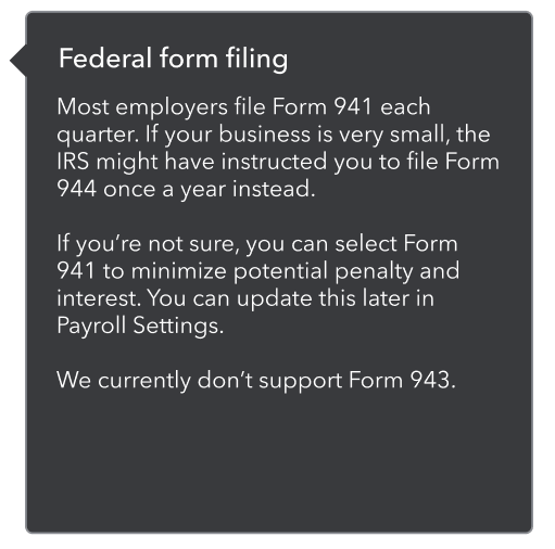
The final version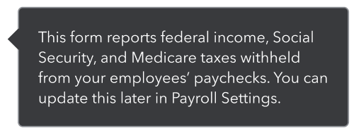
Payment schedule tooltip
All the info presented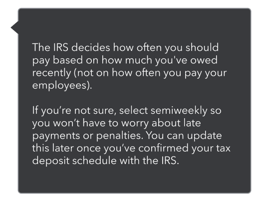
Figuring out the hierarchy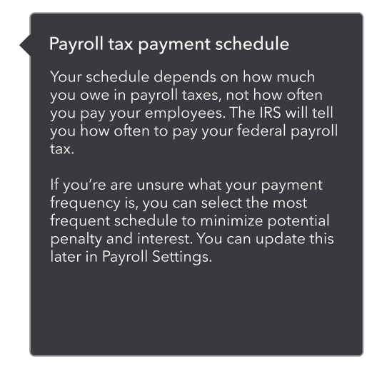
The final version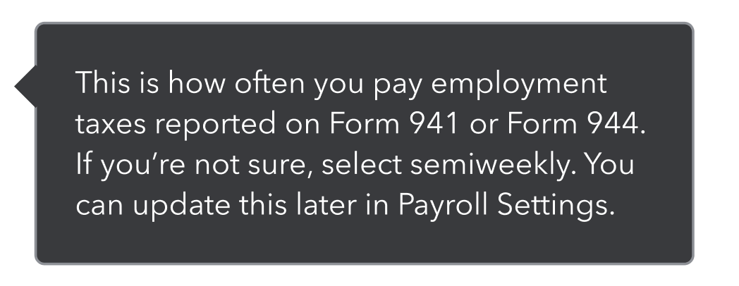
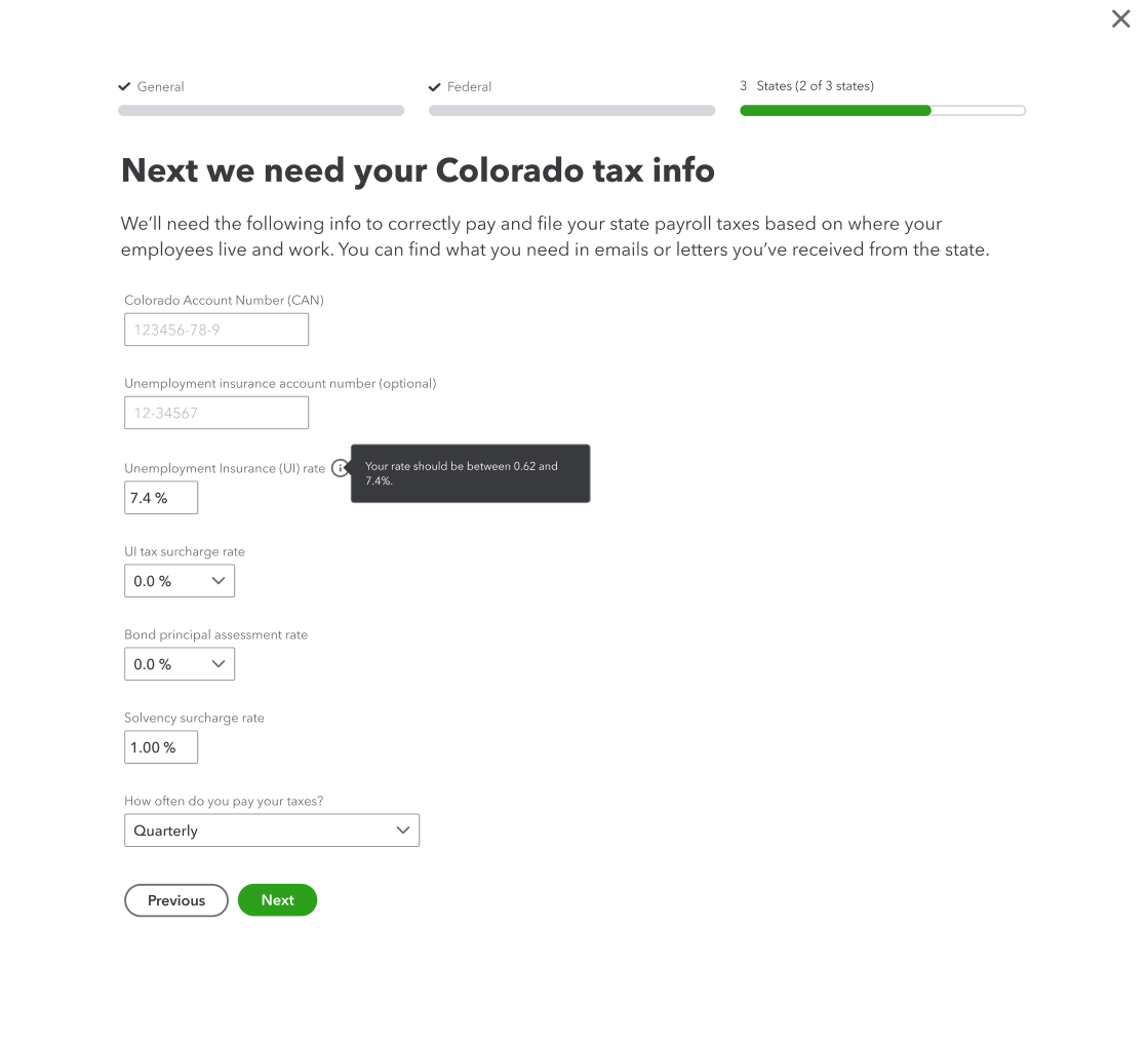
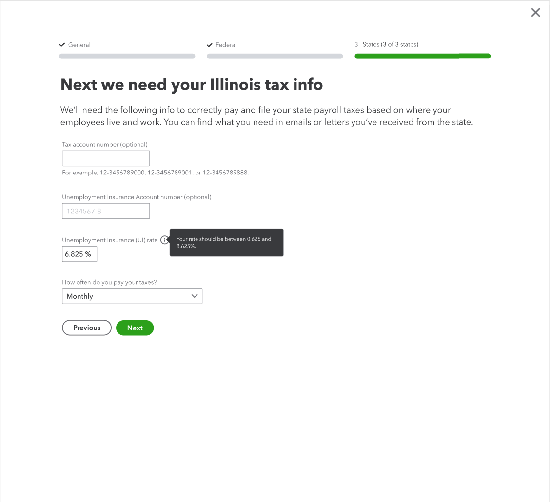
State tax info
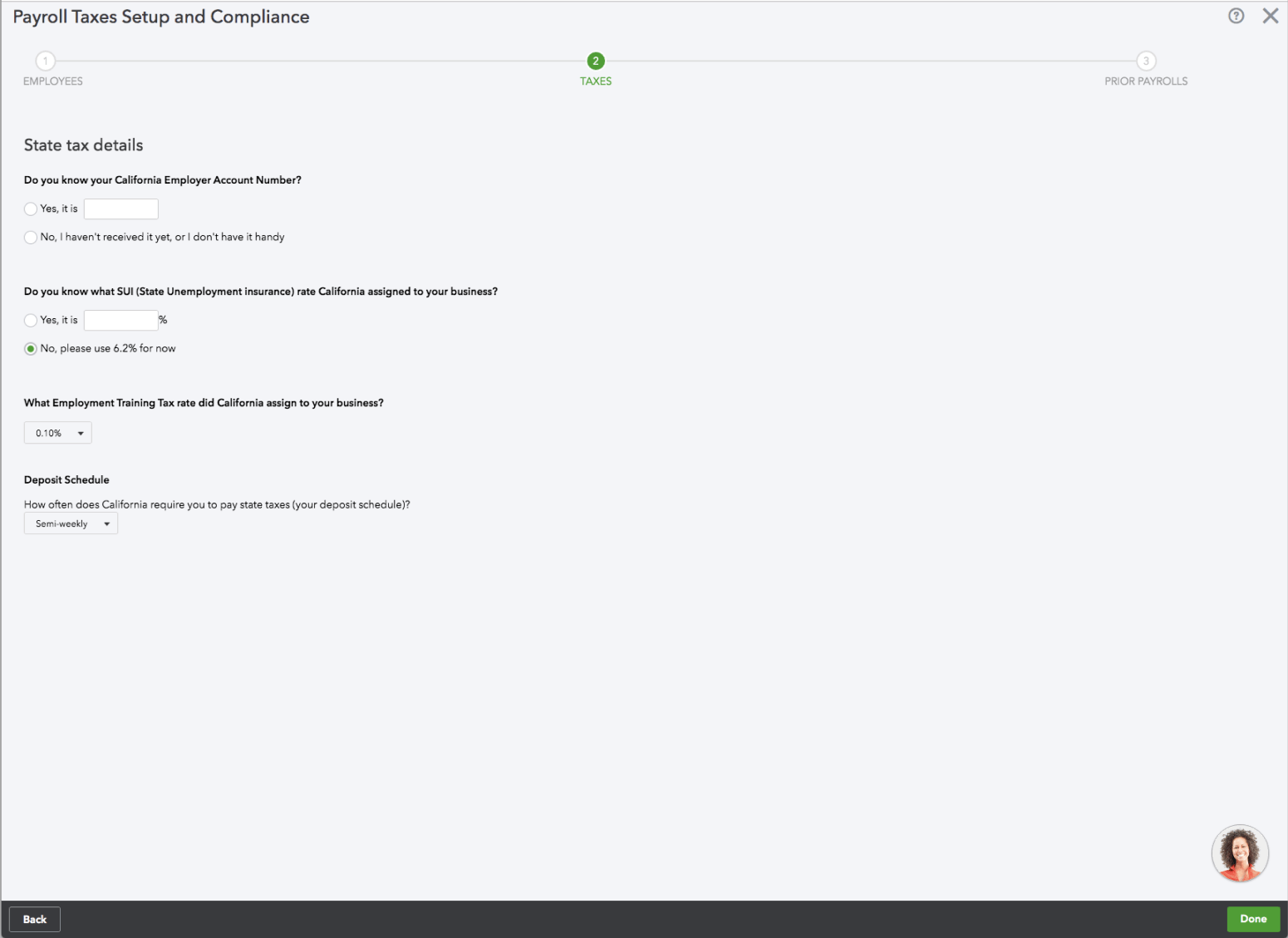
Before
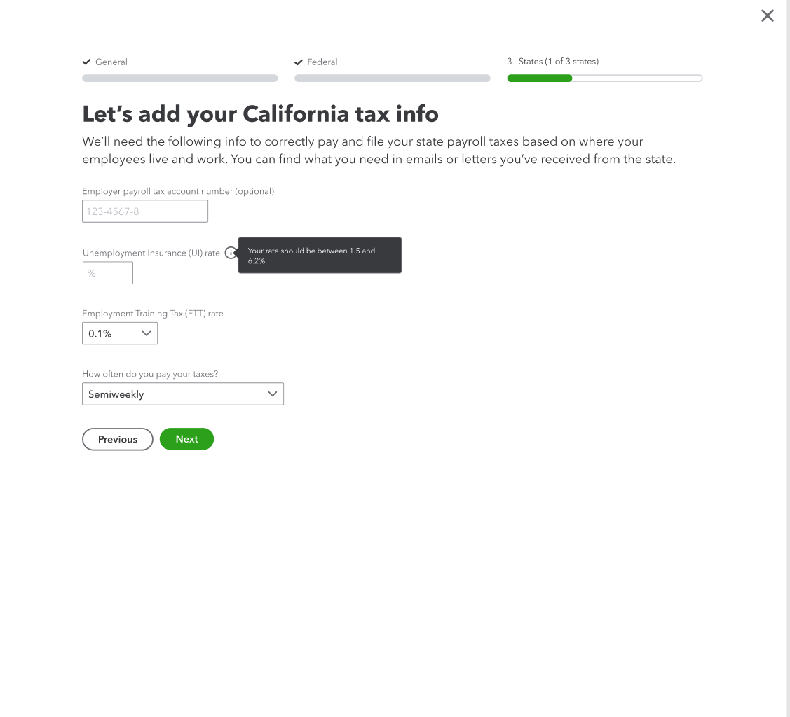
After
I rewrote the content to be more conversational and clarified why we needed this information and where to find it. I added the state name to the header instead of repeating it in each field label, which reduced visual clutter. I also tightened the content and removed details that weren’t needed at this step.